Apps for Economics

I found this excellent site in the Journal of Economic Education as I was researching another topic. In that article, the following overview describes the useful content cataloged on the site:

As the digitization of teaching resources becomes increasingly available, instructors can adapt by making course pedagogy more mobile through incorporating “bring your own device” into the course design. The number of available apps can be overwhelming. We identify many of the best apps with user rankings on a 5-point qualitative scale from Awful (1) to Excellent (5).

Why should we use apps in economics? Strategic selection of an app engages students. This selection offers understanding throughout a range of cognitive domains while providing connections to learning styles that link to individual strengths. Apps provide a hands-on study of economics that can intrigue and satisfy. When students have fun engaging economic apps, their learning and retention increases. Our Web site arranges the apps into seven categories: Study Aids, Calculators, Data, Events, Feedback, Quizzes, and Simulations. Study Aids provide resources for better understanding principles of economics. Calculators identify spreadsheets as well as financial, mortgage, and currency calculators. Data apps profile domestic and international macroeconomic data sources. Events allow class members to keep abreast of current events. Feedback offers instructors a variety of mechanisms to gather classroom responses. Quizzes afford students tools for selftesting of economic concepts. Simulations generate a virtual world to put economics into practice. (Cochran, Velikova, Childs & Simmons, 2015).

 The site is authored by an excellent team of innovators, researchers and educators who have a “passion for technology.” This site is an excellent resource and I hope it continues to be updated.


Reference:

Cochran, H. H., Velikova, M. V., Childs, B. D., & Simmons, L. L. (2015). Apps for Economics. Journal Of Economic Education, 46(2), 231. doi:10.1080/00220485.2015.1006745

WSJ: Is Growth in the Gig Economy Stalling Out? – Flattening Growth Trend in Uber, Etsy and Airbnb

The Wall Street Journal asks, Is Growth in the Gig Economy Stalling Out? Flattening trends are seen using information from Morgan Chase & Co. related to earnings from “Uber, TaskRabbit, eBay, Airbnb and nearly 40 other sites considered part of the “gig economy.””

These new sites and platforms hold the potential to radically reshape the American workforce, leaving a growing number of employees severed from traditional payroll jobs. But just how much is that actually happening? Research has suggested that most of the rise in independent contracting has been happening outside of these high-profile online platforms. And now, the latest data from JPMorgan suggests growth in the number of active users of online platforms is slowing down.

cxunuuqwiamod3r

The report distinguishes between two types of platforms: those where users sell “capital,” whether it’s goods on eBay or Etsy or renting apartments, and those where users sell “labor,” such as Uber, Lyft, TaskRabbit and so on. They find that about 1% of adults are active on such platforms in any given month. That’s up, but only a little bit, from estimates made earlier this year. The period of explosive growth for this type of work may be over. (Only a trivial number of people use both types of platforms.)

This extraordinarily high turnover “implies that growth in online platform participation is highly dependent on attracting new participants or increasing the attachment of existing participants,” the report says. In other words, if companies in the gig economy want to keep growing, they need a strategy to stop people from quitting after a few months.

The post cites a remarkable number of adults who have participated in shared economy jobs but an extraordinarily high rate of churn from these jobs inside of a year. This actually resembles similar trends that occur during normal economic slowdowns where professionals or skilled labor temporarily take on unrelated, sometimes reasonable earning temporary work. But it appears there is a shift back to traditional jobs rather than a new trend that was going to change the world.

Motor Intelligence July Auto Sales

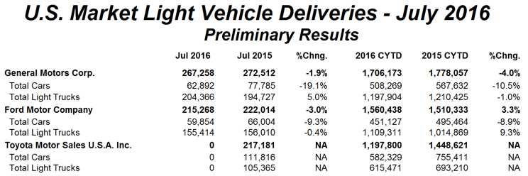
Results from Motor Intelligence returned the following for the nation’s top three automakers:

Autodata 2016 08 02

From the Wall Street Journal:

Sales for the top three auto makers selling in the U.S. slipped in July, reinforcing the view that the light-vehicle market has plateaued after six consecutive annual volume increases.

Declines at General Motors Co., Ford Motor and Toyota Motor Corp. overshadow increases by smaller players; including Nissan Motor Co. and Honda Motor Co. The sustained run of sales gains in the U.S. since the financial crisis has allowed most auto makers to limit reliance on discounts and keep inventories lean, padding profits generated by increased demand for trucks and sport-utility vehicles.

…The auto industry’s recovery has been a bright spot for the U.S. economy, with high factory utilization spurring new jobs, investment in American facilities and wage growth for Detroit’s auto workers. Car buyers spent $49 billion on light vehicles in July, according to TrueCar Inc., up 1% amid longer loan terms and a boom in subsidized auto leases—trends that keep monthly payments on par with a decade ago even as sticker prices go up.

…Overall retail sales are a trouble spot as purchases made by individual customers in showrooms have stalled this year, down slightly for the first seven months, according to JD Power. Auto makers are betting sales to government agencies, rental-car firm and commercial fleets will continue to grow.

…July’s results follow the sober view Ford executives gave last week when reporting second quarter earnings.

BT-AK221_CARSAL_9U_20160802134810

This is certainly a flattening trend from last year’s high, but I would tend to agree with the article’s assessment (quote), “this isn’t doomsday.” In other words, slowing, flattening and even headwinds is not the same thing as a crash, but in our projections for the coming year, we should at least take note and plan accordingly.


Residential Homeownership at More than a 50-Year Low

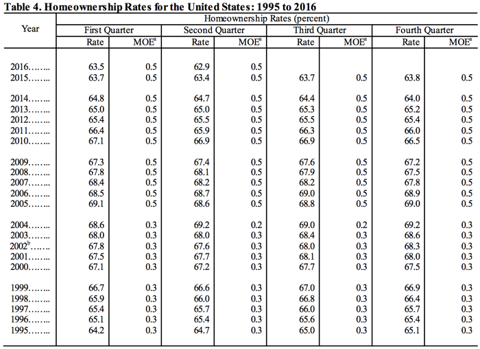
The Census Bureau updated its quarterly Housing Vacancies and Homeownership (CPS/HVS) and returned the following results:

Table 4 2016-07-28

As illustrated by the information in the table, homeownership in the U.S. continues to produce negative results as noted by the Wall Street Journal:

The U.S. homeownership rate fell to the lowest level in more than 50 years in the second quarter of 2016, a reflection of the lingering effects of the housing bust, financial hurdles to buying and shifting demographics across the country.

But the bigger picture also suggests more Americans are gaining the confidence to strike out on their own, albeit as renters rather than buyers.

The homeownership rate, the proportion of households that are owner-occupied, fell to 62.9%, half a percentage point lower than the second quarter of 2015 and 0.6 percentage point lower than the first quarter 2016, the Census Bureau said on Thursday. That was the lowest figure since 1965.

These last statistics are reflected in the interactive FRED chart below:


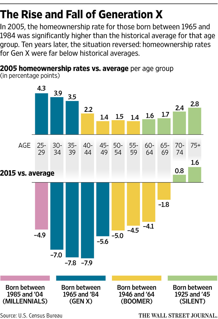
One very interesting element of the homeownership trend is the sociological shakeout among generational groups, with some results as expected, and others left for more in-depth studies:

NA-CJ738_GENX_9U_20160408150908

Source: The Wall Street Journal: http://www.wsj.com/articles/housing-bust-lingers-for-generation-x-1460142759

The full Bureau of Census report can be viewed here and the quarterly updates here.

Three Measures of Unemployment

The FRED Blog has an interesting assessment of unemployment, as measured by the 4-Week Moving Average of Initial Claims, Civilian Unemployment Rate and Average (Mean) Duration of Unemployment:

Take note especially of the Average (Mean) Duration of Unemployment – this corresponds to the “Scariest jobs chart ever” at Calculated Risk. From the FRED Blog using the analogy of the “unemployment bathtub”:

Economists often find a bathtub to be a useful metaphor for the behavior of unemployment. There’s some inflow of newly unemployed workers and some outflow as workers find jobs. A classic way to measure the inflow has been with initial claims of unemployment benefits, the blue line, in which we see spikes at the start of each recession. This inflow of newly unemployed persons initially reduces the mean duration of unemployment, the green line. But the green duration line rises as the blue initial claims line falls—since people who become unemployed early in the recession and remain so are unemployed for a while by the time the recession winds down. Every recession follows this pattern: Claims peak, then unemployment peaks, then duration peaks. The logic is essentially that of the bathtub: First it fills quickly; then, after some time, it begins to drain. But as this is happening, those left in tub have been there longer and longer.

The alarming measurement was just how long it took to reach pre-recession peak levels of jobs lost – a level reached “April 2014 with revisions.” Since we have met and exceeded this level for some time, the concerns now turn to issues such as the levels of employment (part-time temporary vs. full-time) as well as the “quality of jobs.”

FRED Blog: Declining Wage Component in GDP

Using the very simple computation, Compensation of Employees/Gross Domestic Product, FRED data shows some very interesting results over the last five decades:

Since the late 1960s, each run up in this measurement seems to be testing a high in the short run, then is followed by new declines. In some cases, sustained declines, with the last significant run up between the years of 1995-2000. The biggest question is why. The FRED Blog is the first to note that understanding this would require:

Analysis of (i) supplements to wages and salaries such as pensions and other benefits and (ii) proprietors’ income, which is earned by independent workers and business owners that compensates for labor and capital. What we are interested in is whether the decline has bottomed out.

Where are we now in this trend? Again, it is noted in the post, “that call is difficult. If you play with the graph by changing dates—for example, by ending the data in the year 2000 or 1987—you’d find a pretty similar situation in which the decline appears to have reversed.” What is also interesting is the proximity of the short-term high measurements to recessions.

FRB Atlanta GDPNow: Q2 Throttled Down Slightly

From the FRB Atlanta nowcast:

The GDPNow model forecast for real GDP growth (seasonally adjusted annual rate) in the second quarter of 2016 is 2.5 percent on May 17, down from 2.8 percent on May 13. The second-quarter forecast for real residential investment growth declined from 5.3 to 2.5 percent after this morning’s housing starts release from the U.S. Census Bureau, the forecast for real consumer spending growth ticked down from 3.7 percent to 3.6 percent after this morning’s Consumer Price Index release from the U.S. Bureau of Labor Statistics, and the forecast for the contribution of inventory investment to second-quarter growth declined from -0.24 percentage points to -0.39 percentage points after this morning’s industrial production release from the Federal Reserve. The latter decline was concentrated in motor vehicle and parts dealers’ inventories.

NOWCast 2016-05-17Get the full dataset here and report here.

In a Knowledge Worker Economy – Risk OVER the Status Quo?

Nearly thirty years ago, Peter Drucker saw the need for and wrote of the imperative of change management within an information based, highly educated, “knowledge worker” economy and workforce:

To be sure, the fundamental task of management remains the same: to make people capable of joint performance through common goals, common values, the right structure, and the training and development they need to perform and to respond to change. But the very meaning of this task has changed, if only because the performance of management has converted the workforce from one composed largely of unskilled laborers to one of highly educated knowledge workers.

We live in a world obsessed with safety, and mitigation of risk. Inherently, there is nothing wrong with either of these elements, except for the fact that no matter how hard we try, we cannot guarantee either absolute safety or the absence of risk.

In an excellent post in the Harvard Business Review, as summarized in this morning’s Management Tip of the Day, the whole concept of risk versus safety is put to a challenge:

Most of us consider ourselves to be risk averse, but what we consider “safe” behavior often contains much more uncertainty than we suspect…The challenge is that there are very few environments that remain static. “Safe” investments like gold can lose value. You could be fired from your “safe” job. And yet we behave as if the current state will persist in perpetuity. While no one can predict the future, there are a few tactics you can use to get better at evaluating risk. Before you make a decision, do your research on all of the potential avenues of action. Ask credible experts to weigh in. And don’t forget to evaluate the inherent risk of doing nothing. Sometimes the status quo is actually riskier than taking a leap into the unknown.

Excellent advice, see the full post here. Of course, as noted above, risk must be carefully researched and thought out. To use an old word, to exercise prudence, which the Oxford English Dictionary defines as the, “ability to recognize and follow the most suitable or sensible course of action; good sense in practical or financial affairs; discretion, circumspection, caution.” In short, to exercise judgement when making a decision about the future. But too much caution, or worse, being restrained by fear amounts to the idea that we are actually in more control than we are, and that is little more than self-deception.

Hulu Expanding Skinny Options for Cord Cutters – First Step Toward True Broadcast Streaming?

A Wall Street Journal article confirms that, “Hulu is developing a subscription service that would stream feeds of popular broadcast and cable TV channels.” Although the specifics are still a way off, a couple notable highlights from the article:

    • Targeting around a $40 price point for monthly subscriptions, “Many [competing services] are seeking to deliver a subscription pay-TV package that includes a dozen or so popular channels for a price between $24.99 and $39.99”
    • Major networks are involved, “Walt Disney Co. and 21st Century Fox, which are co-owners of Hulu, are near agreements to license many of their channels for the platform…Disney’s ABC, ESPN and Disney Channel are expected to be available on the service along with the Fox broadcast network, Fox News, FX and Fox’s national and regional sports channels”

Competition is fierce, which is good for consumers as the rivals seek to hit a price point and array of options that make sense. The article notes Apple’s frustration with, “its efforts to license programming from big media companies at rates that would allow it to keep retail prices attractive to cord-cutters.”

Susan B. Anthony and the Battle for the $10

From the WSJ, Treasury Secretary Lew Planned to Put Susan B. Anthony on $10 Billthe history of the new face of the $10 dollar bill is more involved than you might think:

Treasury Secretary Jacob Lew originally planned to put Susan B. Anthony on the front of the $10 bill and suspend production of the penny in a revamp of the nation’s money, according to a memo he sent to President Barack Obama last year.

But Mr. Lew decided to ask the public which American woman should go on the $10 bill to inspire a feel-good campaign about women’s contributions to U.S. history, culminating with the final decision announced later in the year. The Treasury launched a splashy website and social-media campaign for “The New 10.”

He ended up getting an earful. Devotees of Alexander Hamilton, the nation’s first Treasury secretary and current face of the $10 bill, rushed to defend him. A grass-roots campaign that had lobbied to put a woman on the $20 bill instead argued for ditching Andrew Jackson, the nation’s seventh president, from the $20 bill.

The March 2015 memo, which hadn’t previously been reported, sheds new light on a couple of long-running currency dramas. The penny suspension hadn’t been announced, though Mr. Lew last fall said it was under consideration.

So will the penny survive? Maybe, “We’ve been looking at the penny for a long time, because obviously the value of a penny has gotten smaller and smaller as time has gone on,” Mr. Lew said at a forum on the $10 bill last November. “Even with low inflation, it continues to diminish.” Many have argued for years the benefits of the penny do not justify its existence any longer. After all, “it cost 1.7 cents to produce a penny in the 2014 fiscal year.”

The Implications of Policy on Public Behavior

The FRED Blog posted a very interesting dataset that illustrates the sway that public policy holds on public behavior, spending decisions and in this case, wealth preservation, “taxpayers adjusted their various income streams by trying to shift income from the beginning of 2013 to the end of 2012. This shift applies primarily to capital income.” The results are illustrated below in a customizable FRED graph:

Other comments in the post help explain the variance between two identical datasets (with the same label):

Both lines have the same title, real disposable personal income per capita, and yet they look very different. The extra careful reader will notice one series has a yearly frequency and the other has a monthly frequency. Here, frequency matters a lot, but not because of the usual concerns about seasonality. Income climbs steeply at the end of 2012 before falling dramatically in January 2013. This has to do with the so-called fiscal cliff: A series of temporary income tax cuts were set to expire on December 31, 2012, increasing the tax rate on personal income for many people in potentially significant ways.

This is quite interesting as it relates to this particular variance, but take a look at the same data from the last sixteen years:


What explains the variances showing very similar patterns? (Including a spike/cliff right in the middle of the Great Crash of 2008.) See the full post here.

Silos in City Hall: We were not meant to live this way

A look around any number at city hall buildings in the greater Los Angeles area or the bay area of northern California will reveal some remarkable similarities. For example, if you are a Baby Boomer or on the older side of Generation X, what springs to mind when you remember the interior of public school buildings? Beige walls, embedded lockers, barbaric bathroom facilities, etc., and a general layout that was strangely familiar (when visiting) from one school to the next. Some of these layouts may have come from educational theory at the time and likely, that so many of the buildings were built about the same time.

Similarly, many city halls were constructed at about the same time, during infrastructure ramp ups in the height of the industrial era. But the configuration and layout of these buildings reflected management theory from that era as well – those rooted in an authoritarian construct. If you look at the average city hall layout, it would almost appear as though it was set up in order to create silos preventing communication and collaboration. These floorpans almost seem to connote organizational disfunction that was by design.

This reminds me of the excellent story of the Omnibus Series Wool. In this post-apocalyptic story, you have what is left of humanity living in a massive subterranean silo with various levels that were responsible for functions that kept the silo going: mechanical and power, healthcare, food, IT, administration, etc. But these levels of the silo, while interdependent on one another, did not generally cross pollinate in the social sense, and they certainly did not communicate well. As the story unfolds, you discover the intentional impediment to both communication and cooperation among the various communities. And they certainly struggled at real problem solving, such as how to eventually live outside the silo. Something within the protagonist kept telling her, “we weren’t supposed to live like this.” (By the way, if Hugh Howey saw his great story being used to illustrate this point, he might recommend that I be ‘sent out to cleaning’.)

Back to city hall layouts. My guess is that the contribution to disfunction was not by design, and that the layouts may have worked well in an era that was highly stable and very slow to implement changes reflected in advancements in business and society. But that brings us to this present time. 2016-04-03_22-01-29Irrespective of what may have worked in the past, why do such physical and organizational silos still exist? I think the root of the problem was captured well in Government Finance Review:

Many local government managers have long appreciated the potential benefits of breaking down silos – the barriers that exist between specialized functions – within government. However, for just as long (and usually successfully), silos have resisted integration. There is a good reason why silos persist: Different tribes of government workers, such as police, fire, building inspectors, and even public finance, benefit from having distinct languages, cultures, and work processes, which help organize the complexity of highly specialized professional endeavors.

This problem is not easily remedied, and there are as many organizational and physical challenges are there are people within these work spaces. The article goes on, “Why, then, despite the impressive gains that can be achieved, don’t silos cooperate more often? It is because the human brain makes sense of complexity by storing information in categories.”

So what strategies will begin to change this culture? It begins with leadership and vision. What worked in a different era may have little relevance today. Where a system, framework, guideline, rule or even workspace only exists because it always has, is probably in need of significant evaluation and assessment. This is especially true given that the largest working group (sub-cohort) in the prime working age bracket of the workplace is now between the ages of 25-29. The age of memos and silos has long past, it’s high time we acknowledged it.