WSJ: Is Growth in the Gig Economy Stalling Out? – Flattening Growth Trend in Uber, Etsy and Airbnb

The Wall Street Journal asks, Is Growth in the Gig Economy Stalling Out? Flattening trends are seen using information from Morgan Chase & Co. related to earnings from “Uber, TaskRabbit, eBay, Airbnb and nearly 40 other sites considered part of the “gig economy.””

These new sites and platforms hold the potential to radically reshape the American workforce, leaving a growing number of employees severed from traditional payroll jobs. But just how much is that actually happening? Research has suggested that most of the rise in independent contracting has been happening outside of these high-profile online platforms. And now, the latest data from JPMorgan suggests growth in the number of active users of online platforms is slowing down.

cxunuuqwiamod3r

The report distinguishes between two types of platforms: those where users sell “capital,” whether it’s goods on eBay or Etsy or renting apartments, and those where users sell “labor,” such as Uber, Lyft, TaskRabbit and so on. They find that about 1% of adults are active on such platforms in any given month. That’s up, but only a little bit, from estimates made earlier this year. The period of explosive growth for this type of work may be over. (Only a trivial number of people use both types of platforms.)

This extraordinarily high turnover “implies that growth in online platform participation is highly dependent on attracting new participants or increasing the attachment of existing participants,” the report says. In other words, if companies in the gig economy want to keep growing, they need a strategy to stop people from quitting after a few months.

The post cites a remarkable number of adults who have participated in shared economy jobs but an extraordinarily high rate of churn from these jobs inside of a year. This actually resembles similar trends that occur during normal economic slowdowns where professionals or skilled labor temporarily take on unrelated, sometimes reasonable earning temporary work. But it appears there is a shift back to traditional jobs rather than a new trend that was going to change the world.

Three Measures of Unemployment

The FRED Blog has an interesting assessment of unemployment, as measured by the 4-Week Moving Average of Initial Claims, Civilian Unemployment Rate and Average (Mean) Duration of Unemployment:

Take note especially of the Average (Mean) Duration of Unemployment – this corresponds to the “Scariest jobs chart ever” at Calculated Risk. From the FRED Blog using the analogy of the “unemployment bathtub”:

Economists often find a bathtub to be a useful metaphor for the behavior of unemployment. There’s some inflow of newly unemployed workers and some outflow as workers find jobs. A classic way to measure the inflow has been with initial claims of unemployment benefits, the blue line, in which we see spikes at the start of each recession. This inflow of newly unemployed persons initially reduces the mean duration of unemployment, the green line. But the green duration line rises as the blue initial claims line falls—since people who become unemployed early in the recession and remain so are unemployed for a while by the time the recession winds down. Every recession follows this pattern: Claims peak, then unemployment peaks, then duration peaks. The logic is essentially that of the bathtub: First it fills quickly; then, after some time, it begins to drain. But as this is happening, those left in tub have been there longer and longer.

The alarming measurement was just how long it took to reach pre-recession peak levels of jobs lost – a level reached “April 2014 with revisions.” Since we have met and exceeded this level for some time, the concerns now turn to issues such as the levels of employment (part-time temporary vs. full-time) as well as the “quality of jobs.”

FRED Blog: Declining Wage Component in GDP

Using the very simple computation, Compensation of Employees/Gross Domestic Product, FRED data shows some very interesting results over the last five decades:

Since the late 1960s, each run up in this measurement seems to be testing a high in the short run, then is followed by new declines. In some cases, sustained declines, with the last significant run up between the years of 1995-2000. The biggest question is why. The FRED Blog is the first to note that understanding this would require:

Analysis of (i) supplements to wages and salaries such as pensions and other benefits and (ii) proprietors’ income, which is earned by independent workers and business owners that compensates for labor and capital. What we are interested in is whether the decline has bottomed out.

Where are we now in this trend? Again, it is noted in the post, “that call is difficult. If you play with the graph by changing dates—for example, by ending the data in the year 2000 or 1987—you’d find a pretty similar situation in which the decline appears to have reversed.” What is also interesting is the proximity of the short-term high measurements to recessions.

Sluggish Wage Growth, Trend or Cycle?

The suggestion that wages have not kept time with costs, even as unemployment has continued to decline is unlikely to surprise anyone, such as the following commentary in the Economist:

Low unemployment means that employers have to try harder to find new workers, while existing workers can threaten to move elsewhere. As a result, workers should be able to demand higher wages. Yet firms in America seem not to have got the message. Inflation-adjusted wages for typical workers are stagnant. In fact, they have barely grown in the past five years; average hourly earnings rose 2% year-on-year in February of 2015: about the same as in February of 2010.

FRED demonstrates this same wage data as a trend, that since the 1980’s has diverged from GDP. The graph below shows the same data as comparative indexes where “it’s immediately apparent that the GDP figure is now higher than wages, meaning that it has grown faster since the 1980s:”

The post notes this caveat when trying to aggregate wages:

It’s not totally obvious how we should define wages—because wage dynamics change so much over the distribution. Low, medium, and high wages have grown at different rates and at different times. From a macroeconomic perspective, however, it makes some sense to measure the average wage. The effect of so doing is that we put more weight on the higher earners than the average person, a result of a positively skewed wage distribution. (Recall the definition of skewness: Here, it means the top tail can pull up the mean past the average person’s wage, the median wage.)

But why? According to the same post, both GDP and BLS data “plummeted in the Great Recession, but since then have been growing at about the same pace. The decline in wages as a fraction of GDP is not a result of a sluggish recovery from the Great Recession, but rather from effects predating it.” This still does not explain why, but more or less, what has happened. Again, the same post in the Economist suggests a “wage hangover,” where “firms preferred to return to more normal management conditions, and to let too-high wages adjust over time: “pent-up” wage cuts have been achieved simply by not granting raises. Wages, in other words, are not rising by more because in many cases they are already too high.” Wow! That is so simple yet reasonable, it may very well be a significant factor contributing to this trend. Another factor cited is what many of us know anecdotally as well as from the data: “part-time for economic reasons” and other forms of un- or under employment.

An Aging Nation: U.S. Census Interactive Graphic

Last year, the U.S. Census issued an excellent report, An Aging Nation: The Older Population in
the United States – Population Estimates and Projections and as you might guess, the findings are nothing short of alarming. Why? Because the findings in the report have a number of significant implications connected with aging in general and all its added responsibilities such as health care and social security. What’s more, the very large baby boom cohort (the report uses the traditional timespan of those born from 1946-1964) has for some time represented such a significant part of the work force, but now its rotation out of the workforce is adding to the weight of what the report labels, “older population” (defined as those above 65 years of age). Combine this with the extrapolation of the older Generation X cohort in the next few decades, plus overall mortality projections showing increased life expectancies and you have a mind boggling number of people not only meeting the definition of older, but in excess of 85 years of age.

Historical Look Using an Interactive Graphic

Below is an interactive graphic from the Census Bureau that can be used in two ways. Slide the year along the bottom for a view of the population breakdown by age at a given point in time in the last ten to fifteen years. Going back fifteen years to the year 2000, you see a very large cohort in their thirties to early fifties. As you slide the year to the right (toward the present), you see the rising age, which is somewhat self-obviating given the starting point. But then as you reach the near present, you see a surprising trend of a new cohort, now in their early twenties to early thirties, representing a significant part of the population.

Implications of the Elderly

According to the projections in the Census report:

Between 2012 and 2050, the U.S. population is projected to grow from 314 million in 2012 to 400 million in 2050, an increase of 27 percent…By 2030, more than 20 percent of U.S. residents are projected to be aged 65 and over, compared with 13 percent in 2010 and 9.8 percent in 1970.

The report identifies mortality rates as the driver of trends:

The size and composition of the older population in 2050 will be largely determined by two factors: the size and composition of the population 27 years and over in 2012 and the future course of mortality for that population. While past fertility rates were the main driver shaping the size of these cohorts to date, mortality will influence the pace at which that population declines at the older ages.

…The mortality assumptions for these population projections are guided by past trends and current levels of mortality observed in the United States and in other developed nations. Trends in health-related conditions such as smoking and obesity were also assessed.

Survivorship rates have shown improvement for many decades. In the United States, life expectancy at age 65 was 15.2 years in 1972 and rose to 19.1 years in 2010—a net gain of 3.9 years. The survival gains for those turning 85 have also been impressive. In 1972, the average time to live for someone turning 85 was 5.5 years. By 2010, this had risen to 6.5 years—a net gain of 1 year. Similar trends have been observed in almost all developed nations. For example, life expectancy at age 65 in Sweden increased from 15.7 years in 1972 to 19.8 years in 2010. Life expectancy at age 85 in Sweden increased from 4.9 years in 1972 to 6.2 years in 2010.8

There is a little bit of irony in these trends. On the one hand, you have things like the reduction of smoking that is practically guaranteed to reduce health risks and increase life span in most people. But on the other:

The incidence of obesity increased dramatically between 1980 and 2008, doubling for adults and tripling for children (National Center for Chronic Disease Prevention and Health Promotion, 2011)…The direct effect of obesity on survival is less than that for smoking, and there is evidence that the trend is leveling off. The longer-term implications are yet unknown, but could dampen continued improvements in survivorship in future years.

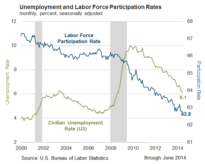
These trends may simply point to the advancements of medicine and technology, but as the above quote points out, the long-term implications of this fairly recent trend are yet unknown. Where is this all leading? As mentioned previously, there are significant implications for Social Security and Medicare, but these are only two examples (although the largest by far) as there are many pension and health care systems throughout the different states and regions of the U.S. There is also the continuous discussion of potential growth in the overall economy. The idea that traditional growth of 4% is not currently realistic (or possible) given the number of workers from the boomer cohort reducing labor participation rates and thus reducing spending, is a common assumption. On the other hand, the very large cohort representing a younger population as well as those in their prime working ages cannot be ignored. While it’s true that availability of workers does not produce jobs, if a number of fundamentals change in the next few years, there could be expansion that we have not seen in years. How might this match off against the implications of an aging population? One thing is certain, in the traditional sense of employment, we have not yet figured out (cumulatively) how to best utilize this large, younger cohort. And we have still not yet adjusted to a post industrial era.

The Marginally Attached – A Look at the Five Largest States

The U.S. Bureau of Labor Statistics (BLS) defines marginally attached in simple, straightforward language:

Marginally attached workers
Persons not in the labor force who want and are available for work, and who have looked for a job sometime in the prior 12 months (or since the end of their last job if they held one within the past 12 months), but were not counted as unemployed because they had not searched for work in the 4 weeks preceding the survey. Discouraged workers are a subset of the marginally attached.

Discouraged workers
Persons not in the labor force who want and are available for a job and who have looked for work sometime in the past 12 months (or since the end of their last job if they held one within the past 12 months), but who are not currently looking because they believe there are no jobs available or there are none for which they would qualify.

For the purpose of illustration, the FRED graph below has the top five states  selected (which accounts for more than a third of the nation’s population), showing the trend of marginally attached workers for more than a decade.

The trend lines show the inherent headwinds since the beginning of economic recovery in June 2009. The still “on the grid” numbers of the marginally attached and discouraged workers has hung on much longer than a decade ago. What’s more, six years into recovery, not one of these states has returned to its pre-recession level of the marginally attached:

Marginally Attached-Pre-Recession

This could be due in part to an aging population as well as population shifts and growth in general. This also illustrates why for so many, the recovery has not felt like a recovery. The reality is, jobs are being added as illustrated by the decreased levels of the marginally attached from the corresponding peak levels by state (peak levels were between July 2010 and October 2011):

Marginally Attached Percentage Below Peak Levels

Ignorance is NOT Bliss

“The only real mistake is the one from which we learn nothing” – John Powell

Right now the overall job market is an undeniable difficulty for us as a country. Thinking about this reminds me of a few things from some years back. The above quote causes me to reflect on a few difficult times and painful past lessons – experiences which are now filtered with hindsight (and the advantage of 20/20 vision as it were). But I am thankful for the experience of many of these difficulties, though some have taken years to get to that point. After one painful business experience in particular, I was encouraged by a friend (at a different stage in life and much more experienced than I) to journal out what I had learned. I remember that at that time, I didn’t want to hear of it, and I certainly didn’t want to talk about it, even alone within the very safe pages of a journal. All I could think about was the frustration I was experiencing from my own decisions, some of them hasty. But learning is an ongoing, dynamic process.

Sometimes, I believe, we don’t feel quite ready to learn from what we are presently going through. Which is part of the reason I am determined to learn from decades past, because our current problems span way beyond few years of misguided choices. I am optimistic too, because I think for many, there is an honest inquiry into present difficulties, and why past approaches may no longer be relevant. Ultimately, I want to be a better learner, and a better practitioner of that knowledge and experience.

Labor Participation Rate Unchanged – Third Month

From the Atlanta Fed this week:

The unemployment rate declined from 6.3 percent in May to 6.1 percent in June, its lowest level in nearly six years (since September 2008). The decline to 6.1 percent was a result of a 325,000 decline in the number of unemployed persons, reaching roughly 9.5 million people. The labor force participation rate was 62.8 percent for the third consecutive month.

Unemployed-Participation

Yet there is still the very stubborn number of those not in the labor force (that continues to climb) reaching its current high of 92.1 million according to the BLS:

BLS Not In Labor Force 16 & Older

Positive Employment Report and Your Own Future

Today’s employment report was encouraging and yet, discussion after discussion continues to reveal the problem of matching up skill sets and the right fit with currently open positions. This problem is amplified by technology, the economics of downsizing (particularly human resources and the use of professional external recruiters), and an overall shift of the burden being on the job seeker, not the organization looking to fill a position.

It is well documented that technology has fomented the flood of applicant mismatches and in some cases, the ease of applying simply to fulfill the “searching for a job” expectation of unemployment benefits. This of course creates an insufferable morass of material for those responsible of recruiting to sift through on a first pass. There is also the ridiculous advice where applicants wind up “keyword dumping” in their resumes to make sure they show up in a search. Obviously, some keywords are relevant. But a system that filters applicants using a machine and algorithms is inherently flawed. The next problem is one we are all are aware of: the reduction of human resources and particularly, professional recruiters were actually skilled in matching applicants with an organization’s needs. This leaves today’s job seeker in the throes of what Peter Drucker warned of decades ago, namely, that there is virtually no organizational support that can be counted on in terms of a career path. More than ever before, it is up to the individual to take charge of their own future.

As I have discussed this dilemma with many people for all different backgrounds, some of the most profound observations regarding what is required of today’s job seekers have come from those who have enjoyed the benefits of the golden age of the industrial era. In other words, many retirees now in their sixties and seventies, not burdened with the daily grind have time to read, discuss and reflect on the contrast of todays job market with what they experienced in the past. They see the contrast (and struggle among many) between the present and the past and see very clearly that the dynamics of today’s employee are radically and essentially different from everything they experienced in the last forty years. Here are three suggestions to ponder on this topic. I have found them to be recurring themes (but certainly not limited to) what is required of today’s job seeker and those who will advance in their careers: accept uncertainty, continuously improve your own flexibility, and, be prepared to take an aggressive, assertive role in your own future.