COVID-19: Ioannidis vs. Taleb (International Institute of Forecasters)

The International Institute of Forecasters facilitated a very interesting discussion in the form of two scholarly blog posts – COVID-19: Ioannidis vs. Taleb, Learning from the positions of Nassim N. Taleb and John P. Ioannidis in the COVID-19 debate. The idea of this match up of differing views from such profound thinkers is literally brilliant. The setting is what may be the closest thing we have seen of an old fashioned discourse. Pardon me for being old fashioned but actual, respectful dialogue and discourse is what is desperately needed in our present time and has been missing for decades. How much more do we need such a thing in an age where many of our national and international challenges have taken on a complexity due to the natural order of progress, technology and globalization. From the introduction page:

“Two…voices have been highly visible in the public debate, with seemingly diverging opinions. I am thinking here of John P. Ioannidis and Nassim N. Taleb (arguably two of the greatest living thinkers) holding opposing views about how to deal with the present pandemic and its potentially destructive consequences.

…Nassim N. Taleb believes that all efforts and resources should be directed to halt its spread and reduce the number of infected and deaths without any concern about forecasting its future course as the uncertainty of doing so cannot be measured and the risks involved are highly asymmetric. John P. Ioannidis, on the other hand, claims that more reliable information is needed to make multiple billion-dollar decisions and that forecasting has failed us by being too pessimistic about the future growth of the pandemic and by exaggerating its negative effects.

…This debate will not only allow us to better understand the points of view of the two great thinkers but be also left as a guide for how to deal with future pandemics.”

I would only take issue with the comment, billion-dollar decisions, since we are already well north of multi-trillion dollar decisions. Of the two positions, Taleb remains consistent with his central theme for more than a decade, namely, the profound consequences of risk versus upside benefits, and this is only amplified in pandemics, where he states they “represent existential risk.” In other words, survive now:

“Science is a procedure to update knowledge; it can be wrong provided it produces interesting discussions that lead to more discoveries…for matters that have systemic effects and/or entail survival, the asymmetry is even more pronounced.”

Ioannidis, on the other hand, has been one of the few critics of our nation and the world being put on “horror-alert,” with models that he states have:

“Failed when they used more speculation and theoretical assumptions and tried to predict long-term outcomes, e.g. using early SIR-based models to predict what would happen in the entire season.”

One note that I frequently see as both a criticism and straw man argument against Ioannidis that is worth mentioning: he is clearly not saying to do nothing, or that COVID-19 is trivial. He opens his post with the following, “COVID-19 is a major acute crisis with unpredictable consequences.” Later he and his colleagues state, “a doomsday forecast may come handy to protect civilization, when and if calamity hits. However, even then, we have little evidence that aggressive measures which focus only on few dimensions of impact actually reduce death toll and do more good than harm.” See introductory post here, Taleb here, Ioannidis here.

Epidemic Forecasting Challenge: Human Behavior

It is interesting to search and review older articles (looking for pre-COVID perspective) and realize how long we have been discussing these topics that have monopolized our current discussions in the last six months. In The Journal of Infectious Diseases, a study from 2016, Epidemic Forecasting is Messier Than Weather Forecasting: The Role of Human Behavior and Internet Data Streams in Epidemic Forecast, the authors explore the challenges of forecasting the spread of epidemics and compare and contrast with the progress of weather modeling.

The authors note in the abstract:

In the past 3 decades, the weather forecasting community has made significant advances in data collection, assimilating heterogeneous data steams into models and communicating the uncertainty of their predictions to the general public. Epidemic modelers are struggling with these same issues in forecasting the spread of emerging diseases.

Sound familiar? Here’s why, “epidemic models rely on human interactions, multiple data sources such as clinical surveillance and Internet data, and environmental or biological factors that can change the pathogen dynamics.” This reminds me of the hasty rush to a positive affirmation of test and trace (which I would not argue against) but could prove fraught with problems associated with the many and variegated variables of human behavior, requisite cooperation, and potentially unknown interactions (such as if asymptomatic superspreaders prove as accurate as is being posited). On this side point, I am not arguing against the activity of test and trace as it may be the best option we have, but the declaration of its success, given the myriad of unknowns.

The authors make a very interesting observation given what we, the entire world have experienced in the last six months, with some profound policy decisions that have been ostensibly driven by data:

Epidemic forecasting is still in its infancy and is a growing field with great potential. The challenges for accurate epidemic forecasting include data availability and emergent changes in human behavior and pathogens.

They conclude with this hopeful note which could prove prescient from four years ago, as phones and data have only increased, “there will be a parallel world, similar to that for weather forecasting, where billions of sensors will be uploading real-time information to obtain personalized disease forecasts.” Full study found here.

Census: More Centenarians – New Challenges as Well

More Centenarians Than Ever

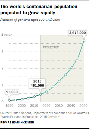
Last year, a post at the Pew Research Center included some very interesting trends in population shift and aging. In a mind-boggling projection, the total number of centenarians is expected to continue to accelerate to seven times the current number of one-half million:

Centenarian Growth Rate

The full study is found in a U.S. Census Bureau report on aging, where a subset of that report states the following regarding centenarians:

Centenarians, people 100 years or older, made up a very small portion of the total population in the 2007–2011 ACS, accounting for 55,000 people (0.02 percent). By comparison, the 65 years and over population accounted for 40 million people or 13 percent of the total population. The majority of centenarians were female (81 percent). Women were also the majority of the 65 years and over population (57 percent). This disproportionately female representation in both the 65 years and over and centenarian populations was expected, since sex differences in mortality over time contribute to higher percentages of females than males at older ages.

Want to live to 100? Then get married??

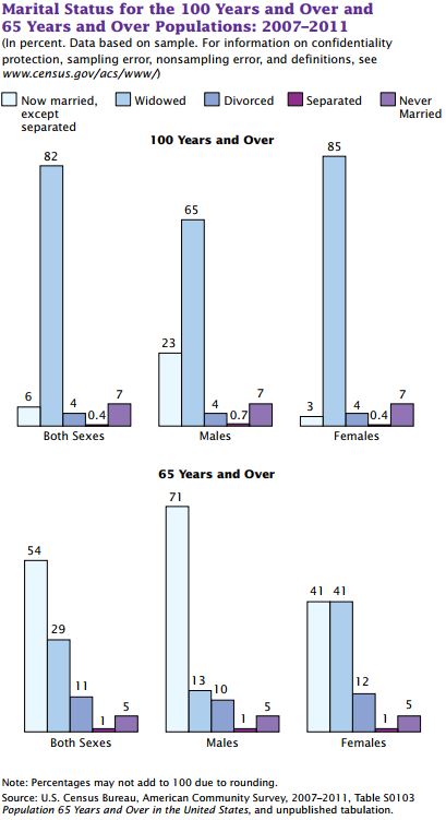
From the same report, some very interesting statistics emerge regarding marital status:

100 Marital Status

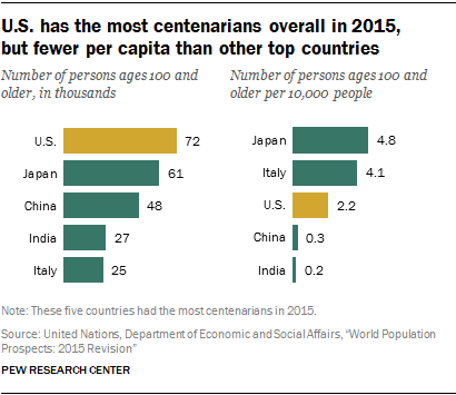
U.S. Leading the Total Count, But Fewer Per Capita

U.S. has the most centenarians overall in 2015, but fewer per capita than other top countries

What Could Possibly Go Wrong?

Aside from a number of questions for social scientists, what could possibly go wrong with living longer? (Which seems to correspond with fulfillment in life.) Life insurance caps. According to the Wall Street Journal, Happy 100th Birthday! There Goes Your Life Insurance, life insurance policies carry “a standard feature that…calls for the termination of the death benefit and payout of all of the built-up savings when the policyholder reaches the specified age.” This is an interesting challenge as it was simply not an issue in the fairly recent past, “the limits weren’t an issue in the many decades when very few people lived beyond 100. But they increasingly are a problem for the U.S. life-insurance industry as more people become centenarians.”

See the study in brief here and the full study here a the U.S. Census Bureau.

Purchasing Power Parity GDP Per Capita – Geo-FRED Interactive Map

As with a number of measures that have recently called our traditional models into question and the way we understand economic activity, the FRED Blog suggests there may be limitations to some of the mechanisms we have used for more than seventy years:

GDP has been used as a measure of economic well-being since the 1940s: It measures the total economic output by individuals, businesses, and the government and is a tangible way to quantify the state of the economy. However, some economists have questioned how well GDP measures well-being: For example, GDP fails to account for the quality of goods and services, the depletion of natural resources, and unpaid jobs that are nevertheless important (e.g., household chores). Although this criticism may be well founded, GDP is highly correlated with other measures of well-being, such as life expectancy at birth and the infant mortality rate, both of which capture some aspects of quality of life.

It’s a self-obviating point that developed nations would have much “higher levels of per capita GDP have, on average, higher levels of income and consumption,” or purchasing power. But other factors weigh into the question of how well off we are in terms of quality of life. Measures such as life expectancy and general health add to the discussion of well-being.

See the interactive map below for a “correlation between GDP and other measures of well-being” where GDP is “still a reasonable proxy of the overall well-being” for any given economy:

See the full FRED post here.

Mathematical Sweet Spot of the Wave? Right Inside…

Well, I guess we just figured out who won the lottery for the coolest postdoctoral work in existence…from Scripps Institution of Oceanography:

For surfers, finding the “sweet spot,” the most powerful part of the wave, is part of the thrill and the challenge.

Nick Pizzo, a Scripps Institution of Oceanography at the University of California postdoctoral researcher, has found the exact location on the wave where a surfer gains the greatest speed to get the best ride.

In a study published this month online in the Journal of Fluid Mechanics, Pizzo applied principles of physics at the ocean’s surface—where air and water meet—to study how energy is transferred from the underlying wave to a particle on the surface, in this case, a surfer.

“Based upon the speed and geometry of the wave, you can determine the conditions to surf a wave and also where on the wave the maximum acceleration, or ‘sweet spot,’ will be located,” said Pizzo, the author of the National Science Foundation and Office of Naval Research-funded paper and an avid surfer.

Pizzo and fellow researchers in the Air-Sea Interaction Laboratory at the Scripps Marine Physical Laboratory and Climate, Atmospheric Sciences, and Physical Oceanography division are studying the mass, momentum, and energy exchanged between the atmosphere and ocean due to breaking waves, to help improve our understanding of weather and climate.

As a wave breaks at the ocean surface, currents are generated and water droplets in the form of sea spray are ejected from the ocean into the atmosphere. These small-scale processes are critical pieces of information to improve weather and climate models to better forecast major storm events and the future climate.


If you really want to be inspired, this work was made possible by grants. Specifically, the Collaborative Research: A Lagrangian Description of Breaking Ocean Surface Waves from Laboratory Measurements and Stochastic Parameterizations. From the abstract:

The goal of this collaborative research is to build a stochastic Lagrangian parameterization of surface wave breaking that can subsequently be applied to wave and ocean modeling. The students and postdoctoral researchers employed in this project will gain experience in the disciplines of science, technology, engineering and mathematics (STEM). The data and breaking parameterization developed here will subsequently find direct application in atmosphere and ocean modeling.

 The following articles were the output of this research:

Deike, L., Popinet, S. & Melville,W.K.. “Capillary effects on wave breaking,” Journal of Fluid Mechanics, v.769, 2015, p. 541.

Deike, L., Melville, W.K. & Popinet, S.. “Air entrainment and bubble statistics in three dimensional breaking waves,” Journal of fluid mechanics, v.801, 2015, p. 91.

N. Pizzo, L. Deike and W.K. Melville. “Current generation by deep-water breaking waves.,” Journal of Fluid Mechanics, v.803, 2016, p. 275.

See also a post on this subject from the U-Cal site.

Brand Value! Los Pollos Hermanos and the New Season of Better Call Saul

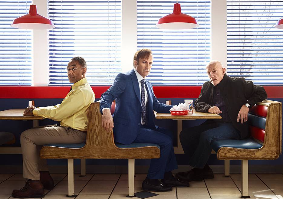
Talk about brand value! For the upcoming (and very anticipated) Season 3 of Better Call Saul, AMC promotes with a very clever tie-in to a social icon from Breaking Bad: Los Pollos Hermanos. From Forbes, “Los Pollos Hermanos was an iconic location in Breaking Bad, with the Mexican themed chicken restaurant serving as the front for Fring’s meth empire.”

From the AMC site:

This imminent existential threat presses Jimmy’s faltering moral compass to the limit. Meanwhile, Mike searches for a mysterious adversary who seems to know almost everything about his business. As the season progresses, new characters are introduced and backstories are further illuminated with meaningful nods to the Breaking Bad universe.

Yes, the end won’t be better than the beginning but the journey is going to be excellent.

BCS

Susan B. Anthony and the Battle for the $10

From the WSJ, Treasury Secretary Lew Planned to Put Susan B. Anthony on $10 Billthe history of the new face of the $10 dollar bill is more involved than you might think:

Treasury Secretary Jacob Lew originally planned to put Susan B. Anthony on the front of the $10 bill and suspend production of the penny in a revamp of the nation’s money, according to a memo he sent to President Barack Obama last year.

But Mr. Lew decided to ask the public which American woman should go on the $10 bill to inspire a feel-good campaign about women’s contributions to U.S. history, culminating with the final decision announced later in the year. The Treasury launched a splashy website and social-media campaign for “The New 10.”

He ended up getting an earful. Devotees of Alexander Hamilton, the nation’s first Treasury secretary and current face of the $10 bill, rushed to defend him. A grass-roots campaign that had lobbied to put a woman on the $20 bill instead argued for ditching Andrew Jackson, the nation’s seventh president, from the $20 bill.

The March 2015 memo, which hadn’t previously been reported, sheds new light on a couple of long-running currency dramas. The penny suspension hadn’t been announced, though Mr. Lew last fall said it was under consideration.

So will the penny survive? Maybe, “We’ve been looking at the penny for a long time, because obviously the value of a penny has gotten smaller and smaller as time has gone on,” Mr. Lew said at a forum on the $10 bill last November. “Even with low inflation, it continues to diminish.” Many have argued for years the benefits of the penny do not justify its existence any longer. After all, “it cost 1.7 cents to produce a penny in the 2014 fiscal year.”

Silos in City Hall: We were not meant to live this way

A look around any number at city hall buildings in the greater Los Angeles area or the bay area of northern California will reveal some remarkable similarities. For example, if you are a Baby Boomer or on the older side of Generation X, what springs to mind when you remember the interior of public school buildings? Beige walls, embedded lockers, barbaric bathroom facilities, etc., and a general layout that was strangely familiar (when visiting) from one school to the next. Some of these layouts may have come from educational theory at the time and likely, that so many of the buildings were built about the same time.

Similarly, many city halls were constructed at about the same time, during infrastructure ramp ups in the height of the industrial era. But the configuration and layout of these buildings reflected management theory from that era as well – those rooted in an authoritarian construct. If you look at the average city hall layout, it would almost appear as though it was set up in order to create silos preventing communication and collaboration. These floorpans almost seem to connote organizational disfunction that was by design.

This reminds me of the excellent story of the Omnibus Series Wool. In this post-apocalyptic story, you have what is left of humanity living in a massive subterranean silo with various levels that were responsible for functions that kept the silo going: mechanical and power, healthcare, food, IT, administration, etc. But these levels of the silo, while interdependent on one another, did not generally cross pollinate in the social sense, and they certainly did not communicate well. As the story unfolds, you discover the intentional impediment to both communication and cooperation among the various communities. And they certainly struggled at real problem solving, such as how to eventually live outside the silo. Something within the protagonist kept telling her, “we weren’t supposed to live like this.” (By the way, if Hugh Howey saw his great story being used to illustrate this point, he might recommend that I be ‘sent out to cleaning’.)

Back to city hall layouts. My guess is that the contribution to disfunction was not by design, and that the layouts may have worked well in an era that was highly stable and very slow to implement changes reflected in advancements in business and society. But that brings us to this present time. 2016-04-03_22-01-29Irrespective of what may have worked in the past, why do such physical and organizational silos still exist? I think the root of the problem was captured well in Government Finance Review:

Many local government managers have long appreciated the potential benefits of breaking down silos – the barriers that exist between specialized functions – within government. However, for just as long (and usually successfully), silos have resisted integration. There is a good reason why silos persist: Different tribes of government workers, such as police, fire, building inspectors, and even public finance, benefit from having distinct languages, cultures, and work processes, which help organize the complexity of highly specialized professional endeavors.

This problem is not easily remedied, and there are as many organizational and physical challenges are there are people within these work spaces. The article goes on, “Why, then, despite the impressive gains that can be achieved, don’t silos cooperate more often? It is because the human brain makes sense of complexity by storing information in categories.”

So what strategies will begin to change this culture? It begins with leadership and vision. What worked in a different era may have little relevance today. Where a system, framework, guideline, rule or even workspace only exists because it always has, is probably in need of significant evaluation and assessment. This is especially true given that the largest working group (sub-cohort) in the prime working age bracket of the workplace is now between the ages of 25-29. The age of memos and silos has long past, it’s high time we acknowledged it.

An Aging Nation: U.S. Census Interactive Graphic

Last year, the U.S. Census issued an excellent report, An Aging Nation: The Older Population in
the United States – Population Estimates and Projections and as you might guess, the findings are nothing short of alarming. Why? Because the findings in the report have a number of significant implications connected with aging in general and all its added responsibilities such as health care and social security. What’s more, the very large baby boom cohort (the report uses the traditional timespan of those born from 1946-1964) has for some time represented such a significant part of the work force, but now its rotation out of the workforce is adding to the weight of what the report labels, “older population” (defined as those above 65 years of age). Combine this with the extrapolation of the older Generation X cohort in the next few decades, plus overall mortality projections showing increased life expectancies and you have a mind boggling number of people not only meeting the definition of older, but in excess of 85 years of age.

Historical Look Using an Interactive Graphic

Below is an interactive graphic from the Census Bureau that can be used in two ways. Slide the year along the bottom for a view of the population breakdown by age at a given point in time in the last ten to fifteen years. Going back fifteen years to the year 2000, you see a very large cohort in their thirties to early fifties. As you slide the year to the right (toward the present), you see the rising age, which is somewhat self-obviating given the starting point. But then as you reach the near present, you see a surprising trend of a new cohort, now in their early twenties to early thirties, representing a significant part of the population.

Implications of the Elderly

According to the projections in the Census report:

Between 2012 and 2050, the U.S. population is projected to grow from 314 million in 2012 to 400 million in 2050, an increase of 27 percent…By 2030, more than 20 percent of U.S. residents are projected to be aged 65 and over, compared with 13 percent in 2010 and 9.8 percent in 1970.

The report identifies mortality rates as the driver of trends:

The size and composition of the older population in 2050 will be largely determined by two factors: the size and composition of the population 27 years and over in 2012 and the future course of mortality for that population. While past fertility rates were the main driver shaping the size of these cohorts to date, mortality will influence the pace at which that population declines at the older ages.

…The mortality assumptions for these population projections are guided by past trends and current levels of mortality observed in the United States and in other developed nations. Trends in health-related conditions such as smoking and obesity were also assessed.

Survivorship rates have shown improvement for many decades. In the United States, life expectancy at age 65 was 15.2 years in 1972 and rose to 19.1 years in 2010—a net gain of 3.9 years. The survival gains for those turning 85 have also been impressive. In 1972, the average time to live for someone turning 85 was 5.5 years. By 2010, this had risen to 6.5 years—a net gain of 1 year. Similar trends have been observed in almost all developed nations. For example, life expectancy at age 65 in Sweden increased from 15.7 years in 1972 to 19.8 years in 2010. Life expectancy at age 85 in Sweden increased from 4.9 years in 1972 to 6.2 years in 2010.8

There is a little bit of irony in these trends. On the one hand, you have things like the reduction of smoking that is practically guaranteed to reduce health risks and increase life span in most people. But on the other:

The incidence of obesity increased dramatically between 1980 and 2008, doubling for adults and tripling for children (National Center for Chronic Disease Prevention and Health Promotion, 2011)…The direct effect of obesity on survival is less than that for smoking, and there is evidence that the trend is leveling off. The longer-term implications are yet unknown, but could dampen continued improvements in survivorship in future years.

These trends may simply point to the advancements of medicine and technology, but as the above quote points out, the long-term implications of this fairly recent trend are yet unknown. Where is this all leading? As mentioned previously, there are significant implications for Social Security and Medicare, but these are only two examples (although the largest by far) as there are many pension and health care systems throughout the different states and regions of the U.S. There is also the continuous discussion of potential growth in the overall economy. The idea that traditional growth of 4% is not currently realistic (or possible) given the number of workers from the boomer cohort reducing labor participation rates and thus reducing spending, is a common assumption. On the other hand, the very large cohort representing a younger population as well as those in their prime working ages cannot be ignored. While it’s true that availability of workers does not produce jobs, if a number of fundamentals change in the next few years, there could be expansion that we have not seen in years. How might this match off against the implications of an aging population? One thing is certain, in the traditional sense of employment, we have not yet figured out (cumulatively) how to best utilize this large, younger cohort. And we have still not yet adjusted to a post industrial era.

The Marginally Attached – A Look at the Five Largest States

The U.S. Bureau of Labor Statistics (BLS) defines marginally attached in simple, straightforward language:

Marginally attached workers
Persons not in the labor force who want and are available for work, and who have looked for a job sometime in the prior 12 months (or since the end of their last job if they held one within the past 12 months), but were not counted as unemployed because they had not searched for work in the 4 weeks preceding the survey. Discouraged workers are a subset of the marginally attached.

Discouraged workers
Persons not in the labor force who want and are available for a job and who have looked for work sometime in the past 12 months (or since the end of their last job if they held one within the past 12 months), but who are not currently looking because they believe there are no jobs available or there are none for which they would qualify.

For the purpose of illustration, the FRED graph below has the top five states  selected (which accounts for more than a third of the nation’s population), showing the trend of marginally attached workers for more than a decade.

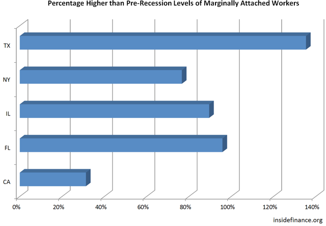
The trend lines show the inherent headwinds since the beginning of economic recovery in June 2009. The still “on the grid” numbers of the marginally attached and discouraged workers has hung on much longer than a decade ago. What’s more, six years into recovery, not one of these states has returned to its pre-recession level of the marginally attached:

Marginally Attached-Pre-Recession

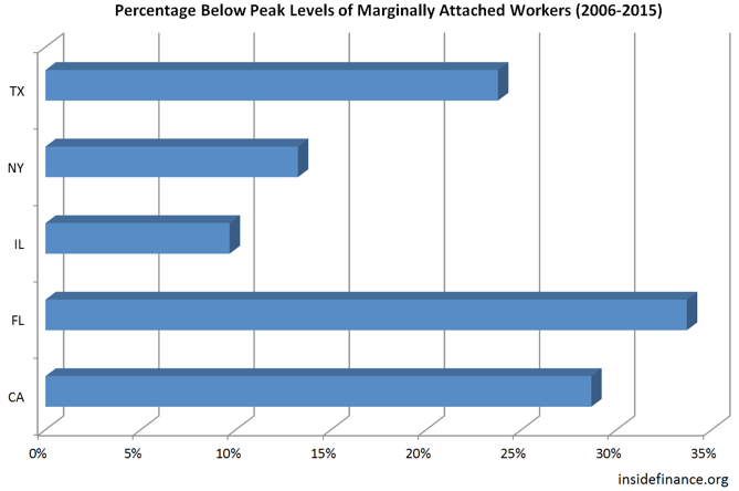
This could be due in part to an aging population as well as population shifts and growth in general. This also illustrates why for so many, the recovery has not felt like a recovery. The reality is, jobs are being added as illustrated by the decreased levels of the marginally attached from the corresponding peak levels by state (peak levels were between July 2010 and October 2011):

Marginally Attached Percentage Below Peak Levels