Labor Participation Rate Unchanged – Third Month

From the Atlanta Fed this week:

The unemployment rate declined from 6.3 percent in May to 6.1 percent in June, its lowest level in nearly six years (since September 2008). The decline to 6.1 percent was a result of a 325,000 decline in the number of unemployed persons, reaching roughly 9.5 million people. The labor force participation rate was 62.8 percent for the third consecutive month.

Unemployed-Participation

Yet there is still the very stubborn number of those not in the labor force (that continues to climb) reaching its current high of 92.1 million according to the BLS:

BLS Not In Labor Force 16 & Older

Population Shifts After Ten Years: 2002-2003 and 2012-2013

According to the U.S. Census, population shift has occurred for the following reasons:

Spurred in part by growth of the energy sector, some metropolitan and micropolitan statistical areas in North Dakota and west Texas are now experiencing rapid population gains, while growth has slowed or halted for some formerly fast-growing areas in the South and West.

What you immediately notice are the dark green shaded areas (representing 3+ percent growth), many of which that were, of course, where the height of the madness was occurring during the real estate boom. Some of these areas were the southwest states and especially California (generally anywhere east of the San Andreas Fault). As well as selected areas in southern states, and even a few high-growth inland areas that saw a tremendous ramp up during the early to mid-2000s such as Idaho.

The last ten seconds of the video shows a contra trend, practically wiping out growth area by area in the same manner that it appeared ten years prior. Corresponding to the quote above regarding the impetus for the current migration in recent years, you see 3+ percent growth in North Dakota as well as the current popularity of Texas. Another very interesting shift is from the north western, Reno area of Nevada to the north eastern area of the same state. What was driving that growth?

At the risk of sounding a bit like Pudd’nhead Wilson for pouring over such things, additional data sets and customizable maps for metropolitan and micropolitan statistical areas can be found here, the interactive map here.

Innovation Is Not Invention

“Above all, innovation is not invention. It is a term of economics rather than of technology. Non-technological innovations – social or economic innovations – are at least as important as technological ones.” Peter Drucker

Based on Drucker’s definition of innovation, when we as an organization, identify community needs and convert them into real-life solutions that affect the health, well being and happiness of a community, that is organizational innovation. This is what is particularly satisfying about working in the public or the non-profit sectors of business. These areas of work lend to mission oriented, values driven activity. But it does not have to be limited to there. With a different application of course, private sector (while a little less public mission oriented), can  be just as values driven and possibly contribute even more in certain contexts. This is the very positive side of understanding how we used to describe commercial activity years ago: business and society.

The Employment Report and Government Hiring

Here are a few notes on government employment trends, and how they relate to the recent employment report. All graphs are interactive.

From the BLS Labor Report,

Government employment changed little in June (+26,000). During the first half of 2014, employment at the federal level declined by 23,000, continuing its long-term downward trend, while local government added 76,000 jobs. State government employment changed little in June, and has changed little, on net, in 2014.

Illustrated graphically, the trend over the last fifty years shows and uneven decent, which not only correspond to recessions, but are most likely the result of technology, innovation and consolidation:

Yet other FRED data seems to indicate that, taken on the whole, government (all levels) are hiring and adding to some of the employment numbers:

Additionally, the rebound of the “all government” measurement of employees has occurred in less than two years:

And  consistent with the BLS report, local government surged, adding to the employment numbers by 76,000:

Finally, the rebound for state and local government shows a different picture in terms of length of time to recover:

Which illustrates this final graph demonstrating over the long haul, which agencies were hit the hardest – the ones where all of us live:

The Sociology of Californians and Wealth Disparity

No matter what your background, leaning, or even possibly, previously held beliefs, there is no denying what many people sense anecdotally at a minimum, and now backed up by a growing body of data: income inequality is on people’s minds. Every economic forum I have attended in the last three years has made mention of this, whether the event was delivered by an economist, politician or business leader. The Field Research Corporation released a study with the following findings,

Majorities of Californians are dissatisfied with the way income and wealth in the state are distributed and believe the gap between the rich and the rest of the population is greater now than in the past. Yet, the public is divided about the extent to which government should try to reduce the wealth gap. In addition, Californians are evenly split when asked about raising the state minimum wage beyond its already scheduled increases.

Regarding the last section cited above, the results are exactly as expected when dealing with any public policy issue that involves the two major parties. Quite honestly, I think that is the part of the poll that most people are least interested in, due to the cynicism and general lack of civility in the discussion of public policy when either party stands to gain or lose as a result of an issue.

There is a very interesting note to this poll as it relates to U.S. born California residents versus foreign-born immigrants,

U.S.-born Californians are more likely to report dissatisfaction with the wealth gap and feel it is greater than in the past. However, they are less apt to feel that government should be doing a lot to try to reduce the gap, and a majority opposes increasing the state minimum wage beyond its already scheduled increases than the foreign-born public.

Foreign-born immigrants, on the other hand, are not nearly as dissatisfied with the way income is distributed in California and are less apt to feel it is greater now than in the past. Yet, a plurality supports government taking a more active role to reduce the wealth disparity, and a majority supports increasing the state minimum wage.

So there is an odd, inverse relationship of opinion among all respondents depending on where they were born and how they feel about the variance in income distribution. And that very same inverse relationship exists among the same respondents on the role of government in resolving this problem. In an interesting footnote to this discussion, the Field Poll found the same pattern to be true among the California Latino population, “majorities of California Latinos born in the U.S. say they are dissatisfied with the way income and wealth are distributed, while Latinos born outside the U.S. are more likely to be satisfied.”

The material point of the survey is the margin of majority who hold these views, cutting across a number of sociological backgrounds as shown in the table below:

Field Poll Income Inequality

What do banks think of the state of student loans?

By now, the study from the Brookings Institution, Is a Student Loan Crisis on the Horizon? has been gone over with a fine toothed comb. And the findings of the study are remarkable with a premise reflected by comments such as,

Typical borrowers are no worse off now than they were a generation ago, and [the data] also suggest that the borrowers struggling with high debt loads frequently featured in media coverage may not be part of a new or growing phenomenon. The percentage of borrowers with high payment-to-income ratios has not increased over the last 20 years—if anything, it has declined.

I think most people who read the above quote, whether in its context are not, have similar reactions. Namely, that this data simply does not, or cannot, square with a number of other variables that we know to be true regarding the pace of economic recovery for the last five years, employment, partial employment and unemployment, a growing variance in the income strata that is undeniable and leaving less and less in the middle, and a record low employment participation rate being among those in their twenties. But gut feeling, and anecdote do not prove anything, what about the data?

As a side note, I have come across a number of recent articles that have come out in a full-orbed, thoughtful response calling bunk on both data journalism, and the childlike faith whereby we accept astonishing correlations that we have never seen before, simply because they are backed up by data sets. I’m not saying there is not value and validity to statistics, but I do think our sociological infatuation with them in pop culture represents an innovation (in the bad sense) in need of some correction.

Dissenting Voices

There have been a number of dissenting voices, and one particularly effective one appeared on the Awl.com, That Big Study About How the Student Debt Nightmare Is in Your Head? It’s Garbage. The article treats volume of debt and rapidly rising tuition, but the ringer is this,

Do you see where that says “based on households with people between 20 to 40 years old with at least some education debt”?…Those aren’t households with people between 20 and 40; those are households headed by people between 20 and 40. Which is to say, this data excludes all people living in households headed by, say, their parents, or other adults.

Another commentary came from a very weighty source, Liberty Street Economics of the Federal Reserve Bank of New York,

We read with interest a new Brookings Institution report, Is a Student Loan Crisis on the Horizon?, assessing the weight of the student debt burden. It was also pleasing to see the New York Times, several of our Twitter followers, and others citing work on this blog in counterpoint.

As part of our policy responsibilities at the New York Fed, we track the landscape of consumer credit, including student loans, using a unique data set developed here. A team of microeconomists described our approach in a March 2012 blog piece on “Grading Student Loans,” and reported key metrics such as the total outstanding student loan balance, averages balances per borrower by age group, and delinquencies at that time. Much of that data is updated quarterly here.

The New York Fed reports that among all other types of debt that increased in 1Q 2014, student loans weighed in with an increase of $31 billion. But most significantly, among the constellation of non performing assets, student loans topped the 90-day delinquency rate with a measurement of 11% – a full 2.5% above credit card delinquencies.

90 Day Delinquency Rates

How are bankers reacting?

In The Wall Street Journal, an article titled, Bank Secrets Can Do Investors a Service revealed the following:

Banks have largely stopped making a very common type of loan. Investors should take note. In a recent paper titled “Banks As Secret Keepers,” four economists argue that banks are necessarily opaque institutions, concealing their portfolios and concentrating on hard-to-value assets. The reason: When investors and creditors can observe the performance of a bank’s assets too closely, its liabilities become volatile and illiquid. When bank assets are cloaked in secrecy, any given liabilities—deposits, repos, commercial paper—can be traded almost as if it were money.

Adding its own graphic on the subject with one notable item:

WSJ Downgrading

And here this the reason:

When investors and creditors can observe the performance of a bank’s assets too closely, its liabilities become volatile and illiquid. When bank assets are cloaked in secrecy, any given liabilities—deposits, repos, commercial paper—can be traded almost as if it were money.

Then this, “an exit often signals that the strategy wasn’t performing as well as hoped.” So what are the non performing assets that have bankers hitting the dump button? “Student lending. If the economists are right about the signaling aspect, this could be the next big troubled asset class for banks.”

As the article points out, even in a worst case scenario, no one expects troubled student loans to have the type comprehensive effects on our economy as the subprime mortgages. But if banking behavior as these institutions seek to mitigate risk is any kind of a leading indicator, all of the data available from the Fed does not seem alarmist at all.


Bank for International Settlements Annual Report and Our Future

The Bank for International Settlements released its 84th Annual Report with the first 121 pages of the 256 page document dedicated to an economic, historical and statistical overview, followed by policy driven conclusions and the prospects of our future as they forecast it. From the beginning, a clear message is stated in its press release,

Time to step out of the shadow of the crisis…A new policy compass is needed to help the global economy step out of the shadow of the Great Financial Crisis…the BIS calls for adjustments to the current policy mix and to policy frameworks with the aim of restoring sustainable and balanced economic growth.

This admonition comes from an assessment of the global market where on the one hand, there is a firming trend in a positive direction. But on the other, despite

Unusually accommodative monetary conditions, investment remains weak. Debt, both private and public, continues to rise while productivity growth has further extended its long-term downward trend. There is even talk of secular stagnation.

Where are we now?

In respect to financial markets, personal balance sheets and indebtedness, the following was noted:

The financial sector’s health has improved, but scars remain. In crisis-hit economies, banks have made progress in raising capital, largely through retained earnings and new issues, under substantial market and regulatory pressure. That said, in some jurisdictions doubts linger about asset quality and how far balance sheets have been repaired. Not surprisingly, the comparative weakness of banks has supported a major expansion of corporate bond markets as an alternative source of funding. Elsewhere, in many countries less affected by the crisis and on the back of rapid credit growth, balance sheets look stronger but have started to deteriorate in some cases.

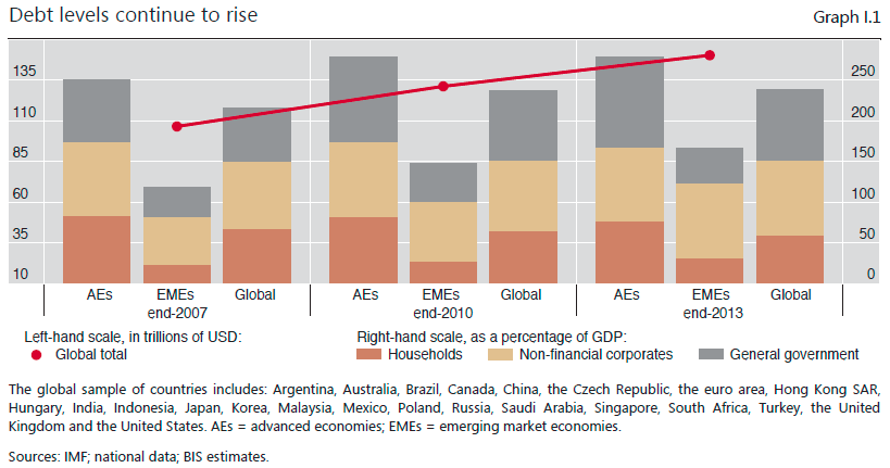
Private non-financial sector balance sheets have been profoundly affected by the crisis and pre-crisis trends. In crisis-hit economies, private sector credit expansion has been slow, but debt-to-GDP ratios generally remain high, even if they have come down in some countries. At the other end of the spectrum, several economies that escaped the crisis, particularly EMEs, have seen credit and asset price booms which have only recently started to slow. Globally, the total debt of private non-financial sectors has risen by some 30% since the crisis, pushing up its ratio to GDP (Graph I.1).

BIS Debt

How does this compare with the U.S.?

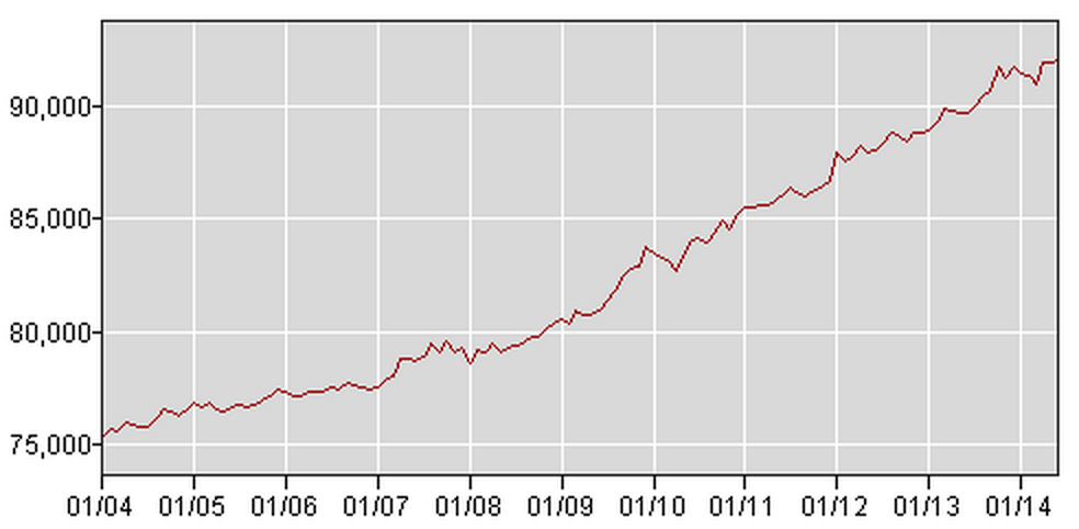
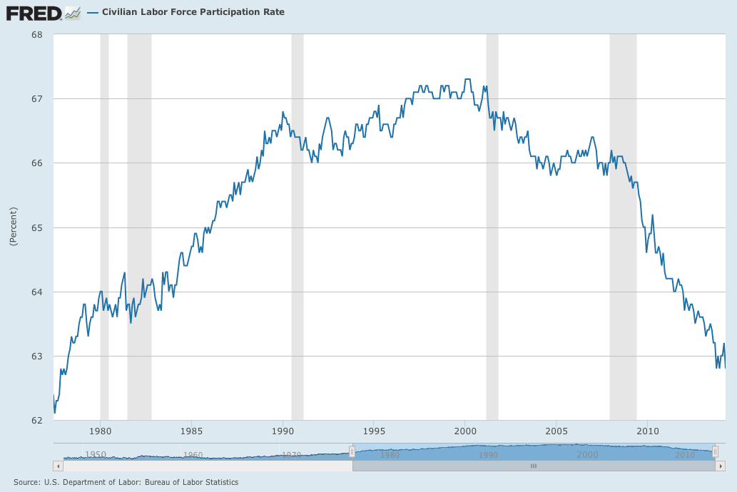
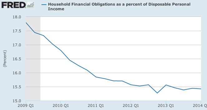
U.S. households started deleveraging at a remarkable rate beginning in Q1 2009 and continued at a steep downward pace until the end of 2013. This trend leveled off as indicated by the FRED data below:

FRED Household Debt

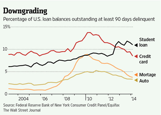
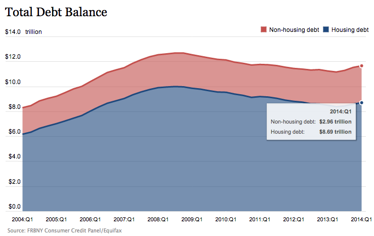
The New York Fed finds household debt has increased for three quarters with the following release from May:

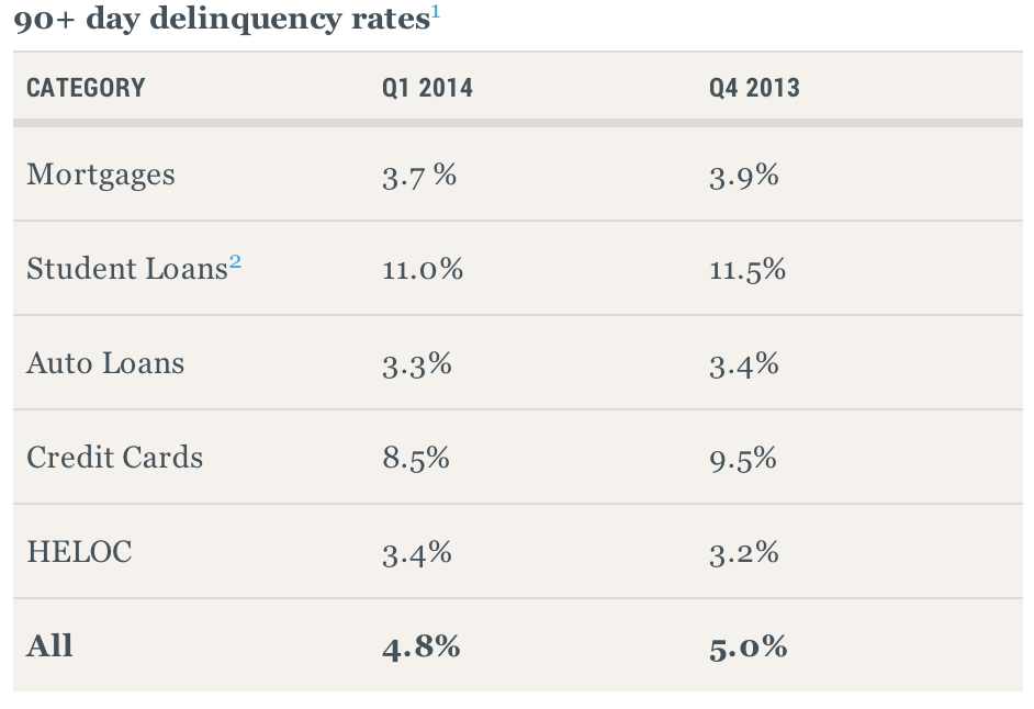
In its Q1 2014 Household Debt and Credit Report, the Federal Reserve Bank of New York announced that outstanding household debt increased $129 billion from the previous quarter. The increase was led by rises in mortgage debt ($116 billion), student loan debt ($31 billion) and auto loan balances ($12 billion), slightly offset by a $27 billion declines in credit card and HELOC balances. Total household indebtedness stood at $11.65 trillion, 1.1 percent higher than the previous quarter.  Overall household debt remains 8.1 percent below the peak of $12.68 trillion reached in Q3 2008. The report is based on data from the New York Fed’s Consumer Credit Panel, a nationally representative sample drawn from anonymized Equifax credit data.

NY Fed Total Debt

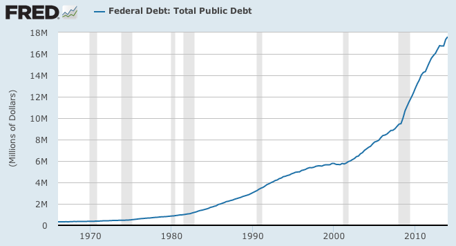
This is combined with what we already know regarding indebtedness at the Federal level, and how it ballooned in direct response to the credit crisis and crash that followed:

FRED Public Debt

And this is consistent with the global findings of the BIS report.

What options are available?

What is somewhat disconcerting is the conclusion that central banks may be running out of options in the event of another recession, “particularly worrying is the limited room for maneuver in macroeconomic policy.” That’s the bad news. And within the limited scope of available options, the following cautionary tone follows the good news of recent months of stability,

The overall impression is that the global economy is healing but remains unbalanced. Growth has picked up, but long-term prospects are not that bright. Financial markets are euphoric, but progress in strengthening banks’ balance sheets has been uneven and private debt keeps growing. Macroeconomic policy has little room for manoeuvre to deal with any untoward surprises that might be sprung, including a normal recession.

Thus the much tweeted comment along the lines of a euphoric market that is completely out of sync with economic fundamentals, sustainable growth, rational debt levels and future employment (for nations such as the U.S.).

The agonizing conclusion of limited options at the policymaker level is derived from the fact that in recent decades, there has simply been too much manipulation,

Credit and property prices soared, shrugging off a shallow recession in the early 2000s and boosting economic growth once more. Spirits ran high. There was talk of a Great Moderation – a general sense that policymakers had finally tamed the business cycle and uncovered the deepest secrets of the economy. The recession that followed shattered this illusion. As the financial boom turned to bust, a financial crisis of rare proportions erupted. Output and world trade collapsed. The ghost of the Great Depression loomed large.

The output of what followed is what is in hindsight understood as a “Balance Sheet Recession.” This is a particularly troublesome term because it sets this recession and recovery apart from other post-war recessions and recoveries in the U.S. The term is explained as follows,

The term “balance sheet recession” was probably first introduced by R. Koo, Balance Sheet Recession, John Wiley & Sons, 2003, to explain Japan’s stagnant growth after the bursting of its equity and real estate bubble in the early 1990s. [The term is used here] to indicate the contraction of output associated with a financial crisis that follows a financial boom.

The question of course is, how does this happen? It all boils down to the management of the “good times” during the run up. Debt is accumulated while expectations of a bright future are soaring. This occurs at the individual and household levels, and permeates institutions and firms all across private sector business, as well as local, regional, state and federal institutions of government. And that is exactly what happened. What follows is the bloating of asset prices that are completely disproportionate with real economic output. When it is discovered (however it occurs in the market psyche) that optimistic expectations cannot continue,  scrambling occurs in the absence of liquidity in the form of fire sale of assets and thus, a priority follows of, “balance sheet repair over spending.” How long and how deep the following slump depends on any number of complexities, but what follows is a struggling economy that is attempting to regain traction in the absence of traditional lending. This means a balance sheet recession can be a very long and difficult recovery,

The empirical evidence confirms that recoveries from a financial crisis are drawn-out affairs. On average, it takes about four and a half years for (per capita) output to rise above its pre-crisis peak, or about 10 years if the Great Depression is taken into account. The recovery of employment is even slower (Reinhardt and Rogoff (2009)).

Policy and Moving Forward

It would appear that little can be done in the short term, other than endure the headwinds of modest growth, especially in the labor market. But in the long term, we can hope that a long struggle with employment may shape the future of monetary policy:

Looking ahead, the transition from extraordinary monetary ease to more normal policy settings poses a number of unprecedented challenges. It will require deft timing and skilful navigation of economic, financial and political factors, and hence it will be difficult to ensure a smooth normalisation. The prospects for a bumpy exit together with other factors suggest that the predominant risk is that central banks will find themselves behind the curve, exiting too late or too slowly.

In other words, will we be able to wean ourselves from the addiction to manipulating markets once growth returns to historic levels? “The argument urging central bank restraint focuses on inflation and the business cycle at the expense of the financial cycle, ignores the impact on sovereign fiscal positions and may well put too much faith in the powers of communication.” The conclusion is that we are at a crossroads. Our financial and banking sectors have made progress, and a significant sociological shift has occurred in terms of our attitudes toward risk and attempts at regulatory reform and implementation. See the full report here.

Employment Participation Rates

Two charts say a lot about civilian labor participation rates. One from the St. Louis Fed (FRED) showing civilian labor participation over the last 36 years:

Civilian Labor Force Participation FRED

The other, from the BLS showing a labor trend over the same time span for those 65 and over:

Civilian Labor Force Over 65 BLS

What are the long-term implications for this? We certainly cannot draw a conclusion based on two charts alone, but this is a recurring theme as we consider retirement (whether it be a pension, Social Security, or any other form) as well as employment among a very large segment of the population made up of Millennial’s. There is a lot of discussion of the number and percentage of Americans 65. The projections in the next 20 years are alarming. A recent post on Five Thirty Eight observes the following:

The recession may have delayed the inevitable for a time. The financial crisis wiped away billions in retirement savings, forcing many Americans to work longer than planned. But the stock market has since rebounded, and there are signs that more Americans are at last feeling confident enough to leave the workforce. The labor force participation rate for older Americans — the share of those 55 and older who are working or actively looking for work — has fallen over the past year after rising through the recession and early years of the recovery. Roughly 17 percent of baby boomers now report that they are retired, up from 10 percent in 2010.

While I agree that some temporarily prolonged entering retirement due to market, the problem with this conclusion on its own is that the trend of increased participation rate among this age group predates this statistic by about 30 years. What’s more, this trend not only predates the statistic, but by an astonishing rate of increase in the last fifteen or so years. I do not believe this trend is the result of simply living longer and certainly not the result of the average American’s job satisfaction. A BLS table for all age groups covering twenty years from 1992-2012 further punctuates this point: steady increases in participation rates as a whole begin with those 55 and older. This really ramps up among those in the retirement age ranks:

Civilian Labor Force Participation Table

I think it is also difficult to draw clear conclusions of what this all means because we do not have a precedent in our country or our labor force to compare this to. Oddly enough, many of those in the higher participation categories have spent much of their careers in what might be considered the golden age of pensions and retirement options. And yet, participation rates from that age group have continued to increase (unless that trend is now reversed permanently based on the series data from the current year). What is required is that we rethink work, careers and entrepreneurship for all age groups. Sixteen years ago Peter Drucker said, “Demographics are the single most important factor that nobody pays attention to, and when they do pay attention, they miss the point.” Speaking of the coming avalanche of retired [age] knowledge workers that he and a few others seem to see very clearly:

Retired knowledge workers with marketable skills are going back to work–but not full-time, not to an office, not to commuting. Working part-time beats sitting at home and moaning or playing bridge all day. The bottom line is that if you go forward to 2010, when baby-boomers will be retiring, increasingly fewer will be blue-collar workers. So most will be able to work well into their 70s.

Three years later (2001) in The Economist, he went on to make the point that while we cannot predict what a new economy is exactly or what it will look like, but that radical and essential sociological shifts are here and now. Perhaps we should have paid more attention to this thirteen years ago. He also pointed out as I stated earlier, the difficulty is that we have little to compare it to in this country. He saw it as plain as day:

Within 20 or 25 years, however, perhaps as many as half the people who work for an organisation will not be employed by it, certainly not on a full-time basis. This will be especially true for older people. New ways of working with people at arm’s length will increasingly become the central managerial issue of employing organisations, and not just of businesses.

Again, adding to this trend, the last six years of our economy has had found implications on what it means for younger people looking for jobs. There is also a remarkable struggle among those of an older age bracket dealing with the challenges of mismatched skill sets. Combine this with the natural order of innovation and technology that now affects jobs previously untouched by technology (information based, service, clerical, etc.) and you have this whole new social order that was spoken of fifteen years ago. In spite of this, there are still tremendous opportunities. But the biggest difference is how much pressure is put on the individual to take active and aggressive steps to take charge of their own future. I think this begins with a complete rework of our perspective of what career means.

Innovation and Finance – Making the Connection

A number of white papers on the topics of service and operational innovation have caught my attention, and I wrote an overview of one recently here. While many of the ideas regarding innovation are similar, the number of perspectives and expanded applications to operational innovation is impressive. As a proposed subspecies of organizational innovation, operational innovation has particular application for accounting and finance. And as such, it seems natural that information technology functions (up to a certain sized organization) commonly fall within the scope of the chief financial officer within the organizational structure. Why does this matter? Because what begins with a mindset toward innovation often requires the necessary bandwidth made available through technology.

In other words, technology in and of itself is NOT the answer. I cannot count the number of times I have seen an expensive system that was purchased in the absence of an organizational mindset that embraces and encourages innovation, and the inevitable happens: it lies dormant or is abandoned altogether. This is a particular shame because not only are resources wasted in the process, but it reinforces the mindset of those who are looking for an example of failure in order to resist change, as if change were being implemented for the sake of itself, rather than a desperately needed implementation that will move an organization forward. So the process begins with a mindset that permeates an organization, encouraging a culture of continuous learning. Although this is a simple and straightforward concept, it is far more complicated to create within an organization (of any type) than to plan.

But once this mindset is in place, or even moving in that direction through leadership or a core group of people, the possibilities for process innovation as it relates to service delivery are tremendous. In an article in Strategic Finance titled, Innovation is for CFOs, Too, the authors Davila, Epstein and Shelton suggest an integral connection to financial operations, organizational innovation and technology,

The accounting and finance functions are an important place to start. Although accounting has changed incrementally over time, we’re grounded in a model that was developed 500 years ago, and we still use that same basic model. That’s okay. The development of information technologies has changed the way we process transactions—and the speed—but the basic model hasn’t changed. Yet approaches to financing organizations and managing cash have changed dramatically over the years. Maybe most important, the role of the CFO has been totally expanded in the last decade or two. Although regulations in accounting and finance constrain some innovation in the corporate finance function, there’s still so much that can be done.

Further discussion of the “much [more] that can be done” will be in a subsequent post discussing this article, which can be downloaded from IMA here.